The Design Philosophy of the Nexmoe Blog Theme
Nexmoe blog theme is a Hexo-based blog template I wrote. But it’s not just a template. More importantly, it is my work. It is an artwork.
Art (Latin: Ars; French/English: Art; Spanish/Portuguese: Arte; German: Kunst) refers to an expressive mode of creating objects, environments, images, actions, or sounds with aesthetic qualities by combining and balancing skills, will, imagination, and experience. It also refers to the human process of expressing perceived and shared feelings of beauty or meaningful emotions and consciousness, and of distilling and presenting personal or collective experiences. [1].
Based on the Wikipedia definition above, from my perspective it’s natural to classify my blog theme as an artwork. That’s not to say I think I’m an artist-I’m still far from a real artist. But Nexmoe is absolutely an artwork created wholeheartedly by an ordinary person like me.
Its artistic value is not only the surface-level feeling of “this theme looks kind of nice,” but the deeper emotions and personal traits embedded within it.
In fact, many people don’t like my theme because they think it uses too many colors-red as the primary color plus various other colors. They think it isn’t minimal enough. I’m also a minimalist, and I often wonder whether I should remove the extra colors and even go black-and-white. Black-and-white palettes can create themes that are clean, mature, and minimal. Many nights I lay in bed unable to sleep, thinking about this. But in the end I decided against it.
The Story of Red
The theme uses red as the primary color: RGB 255/78/106. It’s a very intense red, chosen simply to express my passion and love. I once appeared cold on the surface, but inside I was always full of passion. During a period in high school my life was a mess, and I chose to change. I chose to face my inner self and live-to accept my passion openly and stop compromising with the outside world. That’s when the main color of my theme shifted from pink to red.
Colorfulness and Infinite Possibilities
Besides red, the theme uses many other colors. In fact, I used the seven colors of the rainbow-red, orange, yellow, green, cyan, blue, purple-to express multifaceted love and infinite possibilities. I’m not someone who can focus on just one thing. I can’t become that kind of person. There are so many wonderful things in life-why should I spend every day working on just one? Whether it’s the pure music in Miyazaki films, electronic music, or classical, I love them all. I also love vaporwave, anime theme songs, movie theme songs, folk songs, and even Wang Feng’s music.
I love many things: anime, movies, American TV, Japanese TV, Korean TV, Chinese TV, as well as Chinese novels, Japanese novels, American novels, and novels from around the world. Romanticism or realism-if it’s well written, I read it.
Because of insomnia, I research insomnia-related issues-reading books, searching materials, browsing Wikipedia and CNKI.
Because my health isn’t good enough, I look up information to avoid health problems and seek ways to be healthier.
I write code, read books and literature, cook, sometimes play badminton, sometimes ride a bike. I love science, literature, art, and life even more.
Sometimes I think about giving up-giving up many things. I wonder if I’m even suited for anything. There are far more talented programmers; literature is endless; and as for art, I have almost no ability to create. Sometimes I even feel like giving up on life. But in the end, I didn’t give up anything. Because I love all of this.
Recently I’ve been refining the theme with a “wireless” concept. “Wireless” implies “no boundaries,” and also represents infinite possibilities.
Idealism Hidden in the Design
The theme background is a blurred image. To me, blur often implies ideals or fantasy. Many things aren’t beautiful enough, but if we blur them, we can believe they are-like skin smoothing in beauty photos.
Blur also brings a dreamy feeling. In dreams, many things can be beautiful. We often wake up with tears not because of nightmares or fear, but because the beauty in dreams contrasts sharply with reality. I use blur simply to create a sense of beauty.
Unrestrained, Firmly Being Myself
When I first started this theme project, I decided to open source it. Open source is freedom. No clients, no rules to follow. I only need to follow my heart in design. I often wanted to build a color system so users could better express their feelings and emotions. I never did it, probably because I’m lazy. But if you want to, you can fully modify the theme’s style to match your personality.
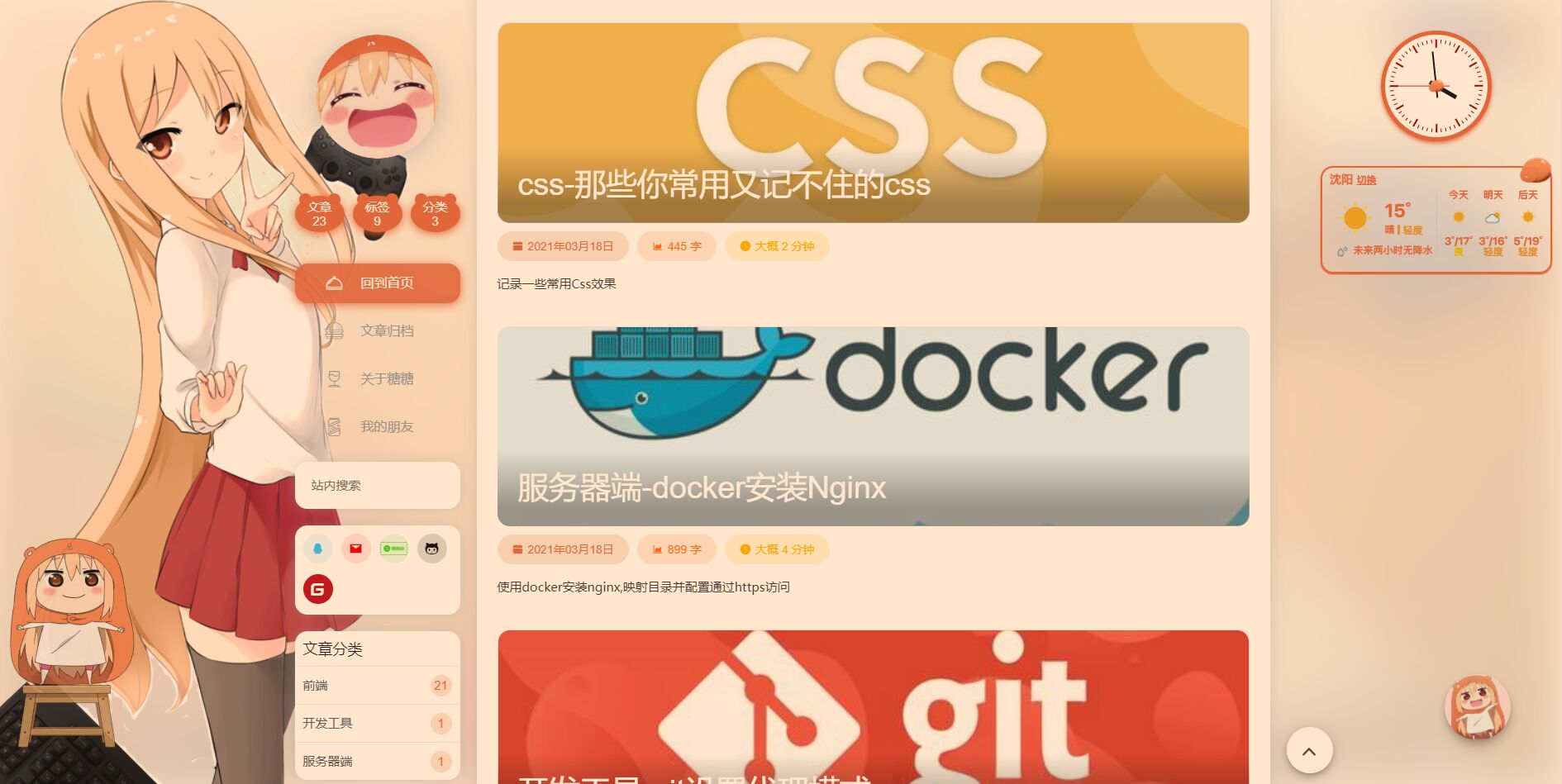
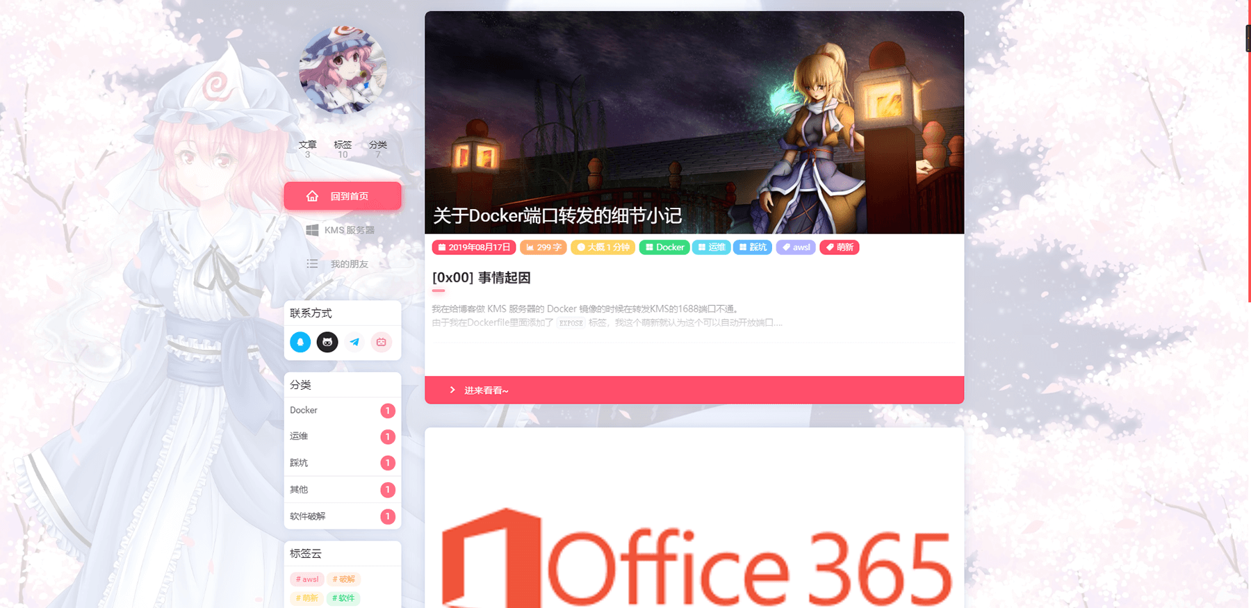
Here are some works I greatly admire:
End
Perhaps one day the Nexmoe theme’s style will change again. Maybe it’s just that I changed.