Complete Guide to Optimizing CLS (Cumulative Layout Shift)
What is layout shift
A short video (about a dozen seconds) explains it clearly.
More precisely: layout shift is when content unexpectedly moves on a webpage due to sudden changes. It’s frustrating because it interrupts reading or causes mis‑clicks. Layout shifts are often caused by async resource loading or DOM elements added dynamically. Common causes include images/videos without size, fonts whose fallback render size differs, or third‑party ads/widgets that resize dynamically.
The painful part is that dev behavior often differs from real user experience: personalized/third‑party content behaves differently in production, test images are already cached in the developer’s browser, and local API calls are extremely fast with almost no latency.
What is CLS
CLS (Cumulative Layout Shift) is a metric.
It measures the largest layout shift score across all unexpected layout changes during a page’s lifetime.
CLS helps address layout shift problems by measuring how often real users experience shifts, enabling developers to take corrective actions.
Why optimize CLS
Layout shift seriously impacts UX—this is clear from the short video above.
It often causes accidental clicks, loss of orientation, and user frustration. Users tend to leave quickly, and sometimes it pushes them off the expected flow.
Optimizing layout shift usually improves user retention and time‑on‑site.
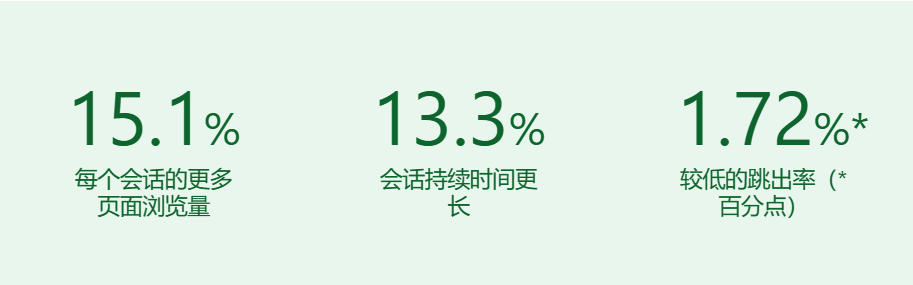
Yahoo! JAPAN News reduced CLS by 0.2 and got the following results.
How to reduce CLS
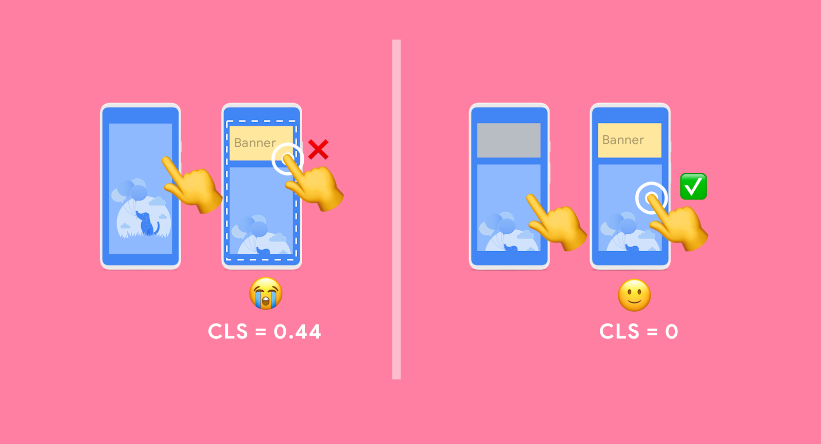
Reserve space for images and media
Always set width/height for images and videos, or reserve space using CSS such as min-height, aspect-ratio, etc.
aspect-ratio
You can directly specify an element’s aspect ratio.
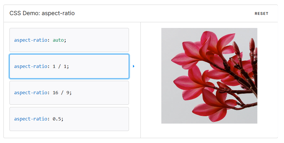
https://developer.mozilla.org/zh-CN/docs/Web/CSS/aspect-ratio
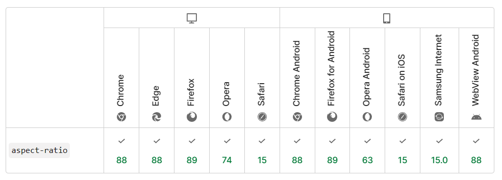
Browser support:
padding-bottom
If you need broader browser support, use the widely accepted “Padding‑Top Hack.” It requires a parent element and an absolutely positioned child. You calculate the aspect ratio as a percentage and set it via padding-top.
<div class="container">
  <img class="media" src="..." alt="...">
</div>
.container {
position: relative;
width: 100%;
padding-top: 56.25%; /* 16:9 Aspect Ratio */
}
.media {
position: absolute;
top: 0;
}Use CSS that doesn’t cause shifts
transform works well. Some examples below.
Examples can be found here: https://play.tailwindcss.com/26PxFA6UVI
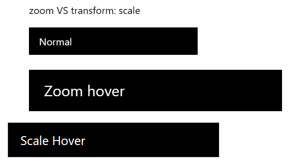
zoom vs transform: scale
When zoom enlarges the page and shifts right, transform: scale scales in place.
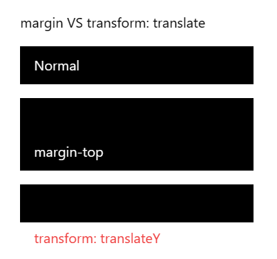
margin vs transform: translate
margin increases the parent size, while transform: translate only moves the element itself.
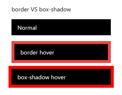
border vs box-shadow
border expands the parent, while box-shadow doesn’t.
Be careful with lazy loading
Lazy loading can cause layout shifts. If you navigate in a long lazy‑loaded list, be careful. Navigation without animation can mitigate the issue to some extent.
Avoid transition: all
On initial load or page transitions, transition: all can cause padding to animate from 0, resulting in layout jitter.
Painful examples: Commit: table and friends icons jitter Commit: fix navbar jitter
Element order causing shifts
On mobile, the main content is shown first, so the sidebar markup appears after it. On larger screens, CSS order is used to place the main content in the middle column (second column). Pseudocode:
export default function MainLayout(props) {
  return (
    <Container>
      <Main className={css`@media screen and (min-width: breakpoint) { order: 0 }`} />
      <Left className={css`@media screen and (min-width: breakpoint) { order: -1 }`} />
      <Right className={css`@media screen and (min-width: breakpoint) { order: 1 }`} />
    </Container>
  )
}
On first paint, the browser hasn’t fully parsed the DOM. It knows <Main /> but not <Left /> or <Right />, so it renders <Main /> in the first column. Only on the second paint does it move <Main /> to the second column and render <Left /> in the first.
Chrome does not parse HTML in a single pass. It pauses parsing and starts rendering in two cases:
- After reading 65,535 bytes of HTML
- After encountering a
<script>tag and reading ~50 tokens
See: Optimize blog CLS
Page navigation and back/forward cache
By default, all browsers use bfcache, but some sites are not compatible. For details on testing and identifying blockers, see bfcache.
After you leave, the page is kept in memory briefly. If you return, it restores exactly as you left it—fully loaded and stable, without any shifts.
Modern SPAs can also keep layout consistent during route changes. Always keep your nav and table of contents fixed on the page.
Fonts
Before web fonts load and render, there are typically two approaches:
- Use a fallback font until the web font loads (FOUT — flash of unstyled text).
- Hide text until the web font loads (FOIT — flash of invisible text).
Both can cause layout shifts. Even when text is invisible, layout is still computed with the fallback font, so once the web font loads, the layout can change just like with FOUT.
To minimize this:
- Use
font-display: optionalto avoid reflow when the font isn’t available at initial layout. - Use a close fallback. For example,
font-family: "Google Sans", sans-serif;ensures a similar sans‑serif fallback. Using only"Google Sans"will fall back to Chrome’s default (Times), which is a worse match. - Use
size-adjust,ascent-override,descent-override, andline-gap-overrideto reduce size differences. See Improved font fallbacks. - Use the Font Loading API to reduce font fetch time.
- Preload critical fonts with
<link rel=preload>so they’re available at first paint. - Read Best practices for fonts.
Use real skeleton screens
Measuring CLS
Production
- Chrome User Experience Report
- PageSpeed Insights
- Search Console (Core Web Vitals report)
- web-vitals JavaScript library
Lab / testing
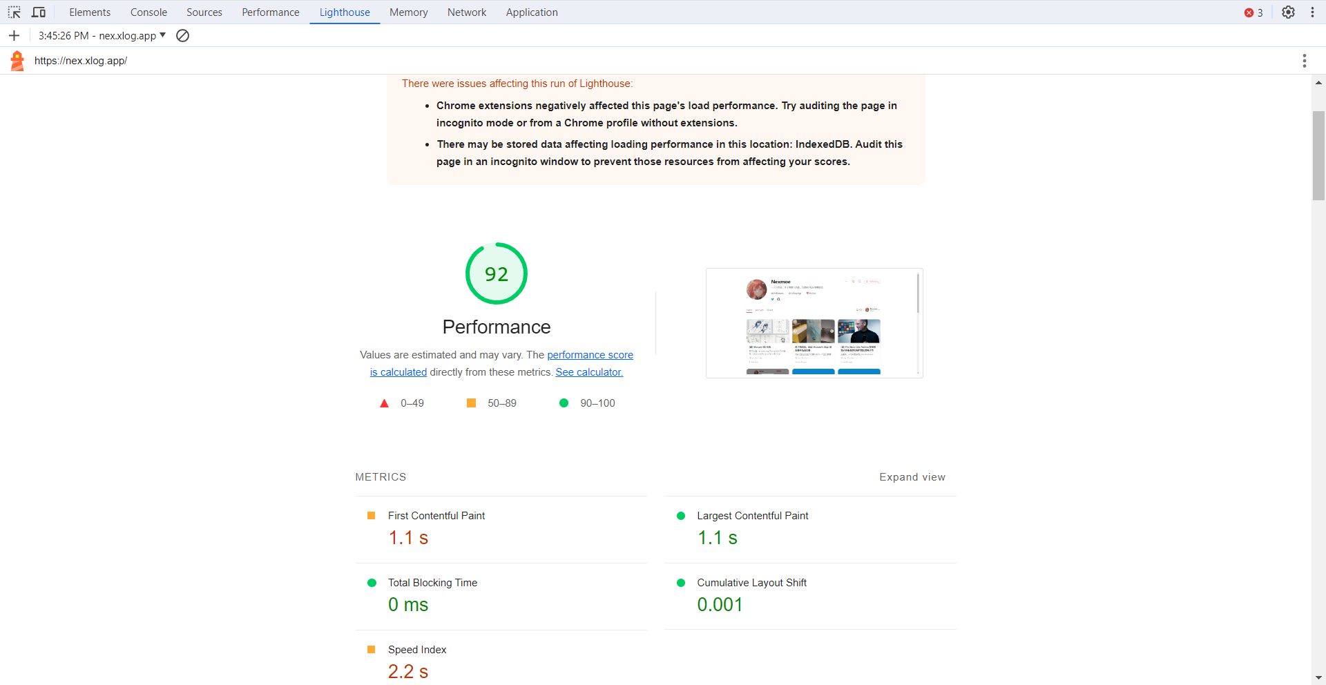
Lighthouse in DevTools
You can generate real‑world performance reports for mobile and desktop, along with improvement suggestions.
Running Lighthouse in DevTools during local development is convenient.
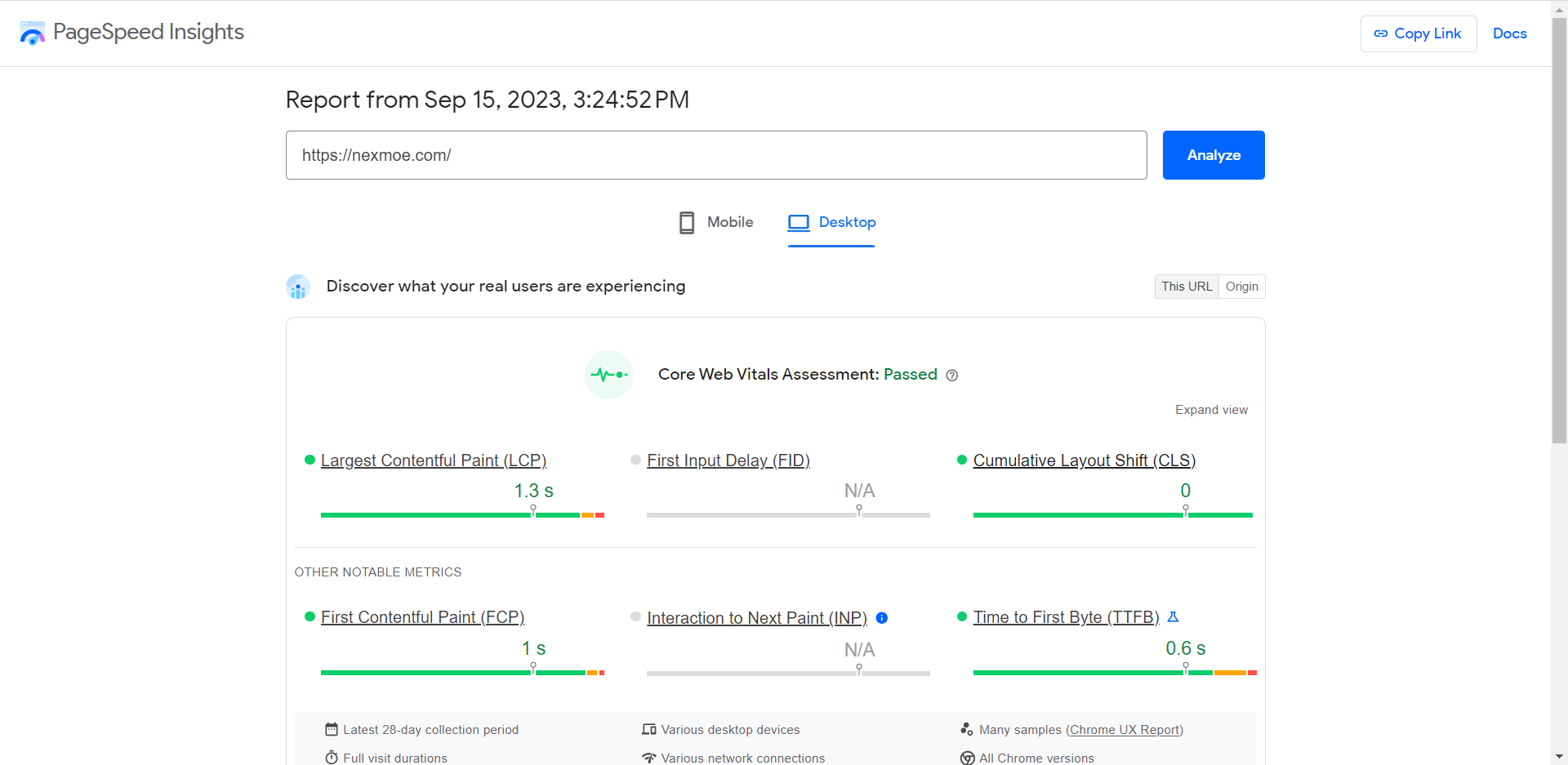
PageSpeed Insights
This is basically the online Lighthouse.
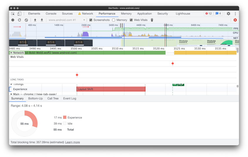
Performance in DevTools
The Performance panel records page behavior over time. The timeline includes an “Experience” track that highlights layout shifts and the elements that moved.
Web Vitals extension
Treat the Web Vitals extension as a spot‑check tool rather than a full debugging tool—the Performance panel in DevTools is for that.

Conclusion
As someone with high standards for my own projects, I’ve often dealt with layout shift optimization and Lighthouse. I just didn’t have a clear CLS concept before. Now I do.
CLS is a fundamental optimization metric and crucial for UX. Every project should address CLS.
If you spot any mistakes, please let me know—thanks!
References
- https://web.dev/cls/
- https://web.dev/optimize-cls
- https://developers.google.com/publisher-tag/guides/minimize-layout-shift
- https://web.dev/yahoo-japan-news/
- https://addyosmani.com/blog/infinite-scroll-without-layout-shifts/
- https://blog.skk.moe/post/fix-blog-cls/
- https://developer.mozilla.org/en-US/docs/Web/CSS/aspect-ratio