Xiaoshu Student Usability Tests and Reflections
Xiaoshu Student is the first product I seriously tried to build. This post records the usability tests I ran, the fixes for problems I observed, and some reflections.
About Xiaoshu
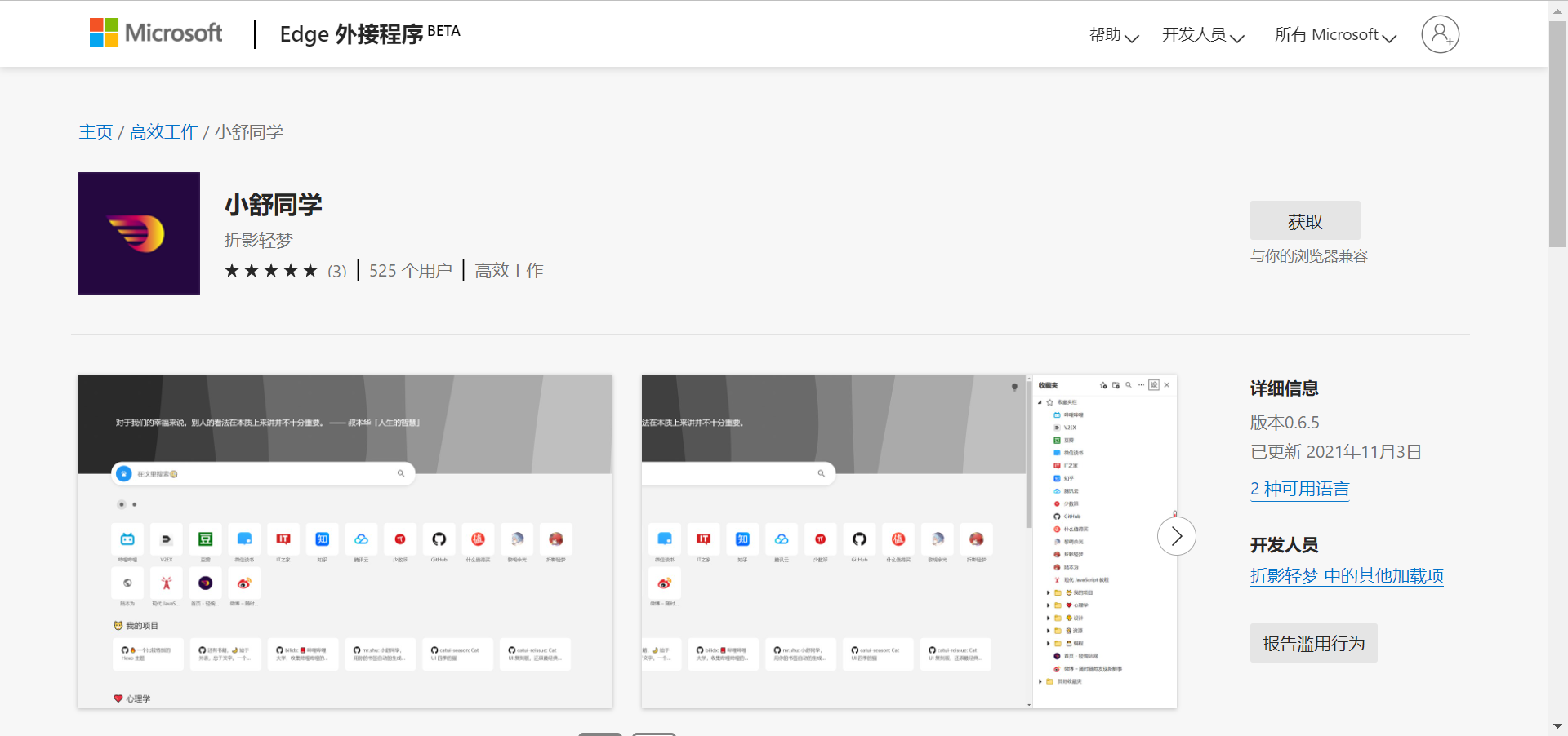
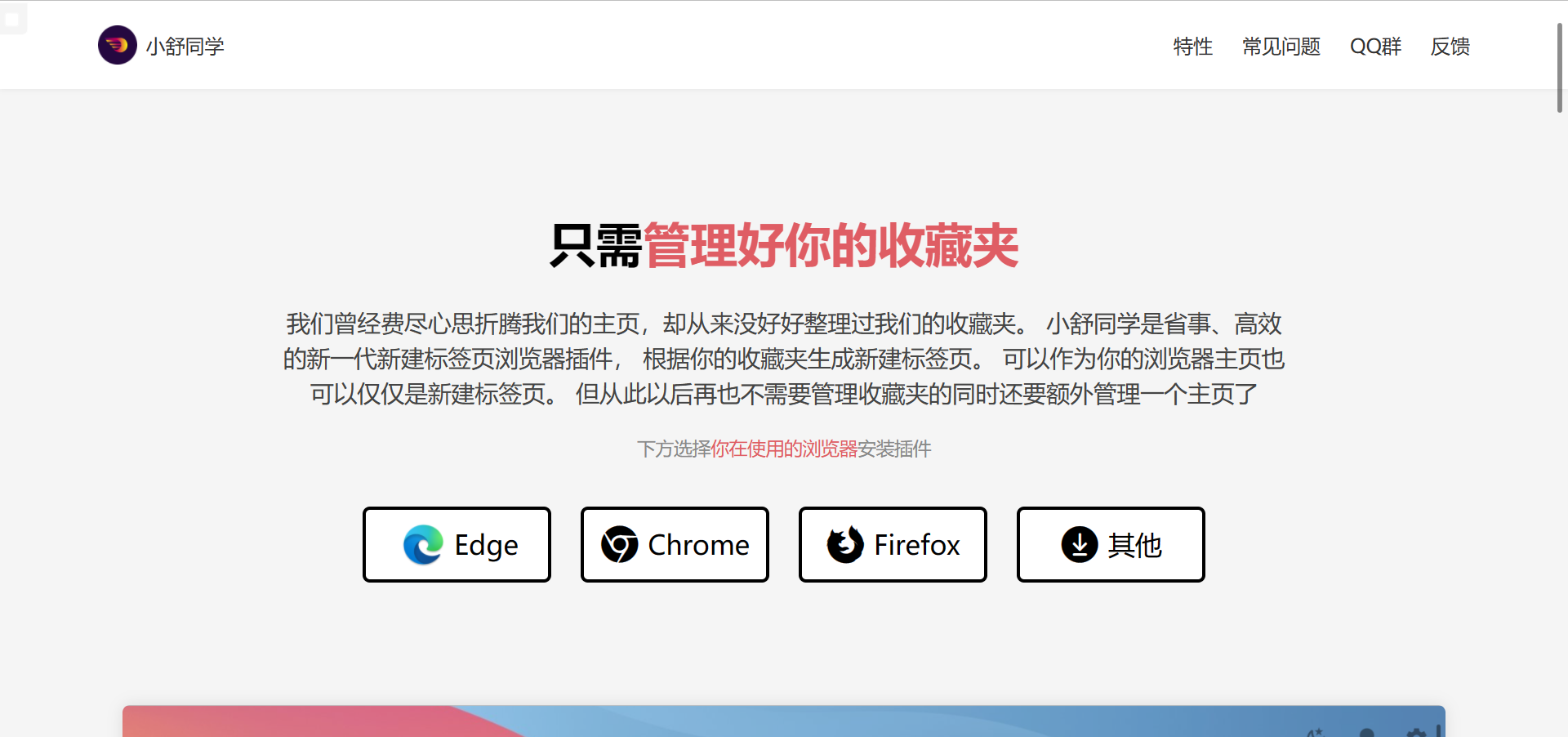
We spent so much effort customizing our homepages, but never properly organized our bookmarks. Xiaoshu Student is a convenient, efficient next-gen new tab extension that generates your new tab from your bookmarks. It can be your browser homepage or just your new tab. From now on, you no longer need to manage bookmarks while also maintaining a separate homepage.
Official site: Xiaoshu Student
Test Setup
I opened the official site and let the test subject use it while I observed without giving hints, to see whether they could install and open Xiaoshu Student smoothly.
If they got stuck for too long and couldn’t proceed, I gave as little guidance as possible.
First Test
My first subject was quite experienced, since they had used Tampermonkey scripts before.
Process
They quickly identified their browser and installed the extension.
However, Edge has a major issue: after you install a new tab extension, Edge disables it and shows a window with a link telling you how to enable it.
The subject clicked the link smoothly, but then got stuck. The test environment didn’t let them calmly read the article content. After a while I reminded them to read it, and they continued.
Second issue: after enabling it, they didn’t know what the extension did, so they didn’t think to open a new tab.
Final issue: Edge popped up the window below, and they instinctively clicked the ×. Fortunately, clicking × doesn’t revert the setting.
Improvements
As my first test subject, they were a fairly “geeky” user, so the flow was mostly smooth. But I still found some shortcomings.
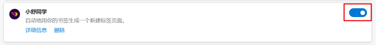
To address these issues, I created a welcome page in the extension. After installation and enabling, it guides users to open a new tab and click “Keep changes.”
However, as of Nov 7, 2021 (when I wrote this), the Edge version still hadn’t passed review, so later tests were done without the guide.
Second Test
The second subject’s process was also smooth, with almost no major problems. It didn’t leave much impression.
Process
The only problem was the same as with the first subject. I have to say Edge’s design with no primary/secondary buttons wastes a lot of time for new users.
Improvements
This was already addressed in the first test’s improvements.
Third Test
The first two subjects were so smooth that I was surprised. This third subject surprised me too, but in a different way. They got stuck at every step. Their understanding of computers was almost zero, and before college they had hardly used computers.
Process
First, they didn’t know what browser they were using-yes, that sad. They got stuck on the four buttons on the homepage for a long time. After I prompted them to look at the icons, they finally chose the correct browser.

Then they clicked in and got stuck again. They didn’t know how to download the extension. For those of us familiar with computers it’s easy, but for them it was total confusion. I have to complain about Microsoft’s design: the “Get” button doesn’t use an accent color, so users who’ve never visited this page get lost. This subject scrolled up and down, tried clicking some accent-colored links, but none were the install path. After guidance they installed successfully.
Unfortunately, they ran into the same problem others did. They didn’t quickly understand Edge’s article, and on the extensions page they didn’t even know which toggle to turn on.
After enabling, they also got stuck at the same points as earlier users.
Improvements
I changed the browser icons on the official site to colored ones instead of white.
I improved the welcome page.
And there are some issues I still can’t solve; maybe I’ll find solutions later.
Fourth Test
The fourth subject also ran into some of the same problems, but by then the site had a few improvements, so it was smoother. I won’t repeat the same issues.
Issues
After finishing all steps, it was time to open a new tab. This subject ran into a new issue.
They had Lenovo PC Manager installed. It forced the new tab to Lenovo’s new tab. I helped manually change it, but that’s not a real solution.
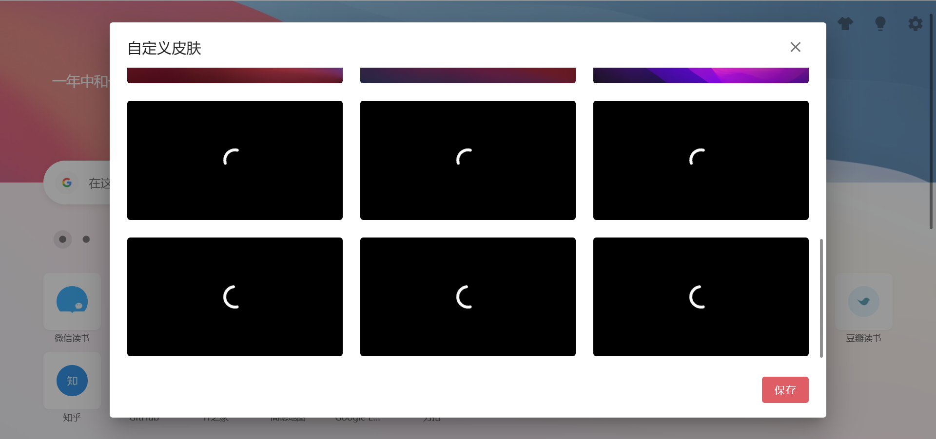
This test also observed a short usage flow. When customizing wallpapers, images loaded slowly, and the subject thought the unloaded images were just black wallpapers.
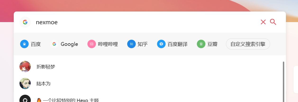
We also tested Xiaoshu Student’s special feature: quick temporary search. We found that adding search engines was not convenient.
Improvements
Added a loading indicator for images. In the future we’ll optimize loading speed and add lazy loading.
To highlight the importance of skins, we moved the custom skin feature to the homepage.
Added a custom search engine button.
Fifth Test
This subject was similar to the third-very much a beginner.
Issues
They didn’t know their browser, but after hesitating for a while they instinctively chose the first button, “Edge.” It proved that putting Edge first was the right design choice.
Then the same issues as above. They also ran into the new tab being locked, like the fourth subject.
It seems the locked new tab issue needs to be solved.
Improvements
Solved beginners’ choice paralysis.
2021-11-07